WASHINGTON
by Jeremy BeasleyI started my design process with the usual research into what license plates were and where they came from. I used to collect plates as a kid so this was a nice little stroll down memory lane.
Over the years, plates have gone quite far away from their original utilitarian form, into a new type of personal and local expression. I’ve got nothing against expression (or even specifically with plates) but this trend has certainly led to some of the most horrid graphic design I’ve ever seen.
So many of the original Washington plates I found were quite beautiful in their simplicity. No nonsense, no graphics even. Just the name of the state and the big number, nothing distracting from the two key pieces. Design was entirely informed by it’s clear purpose and the production capabilities of the plates themselves.
Personally, it felt arrogant to not to start with where we were and build on that. Of all current state plates, Washington’s was certainly not the worst.
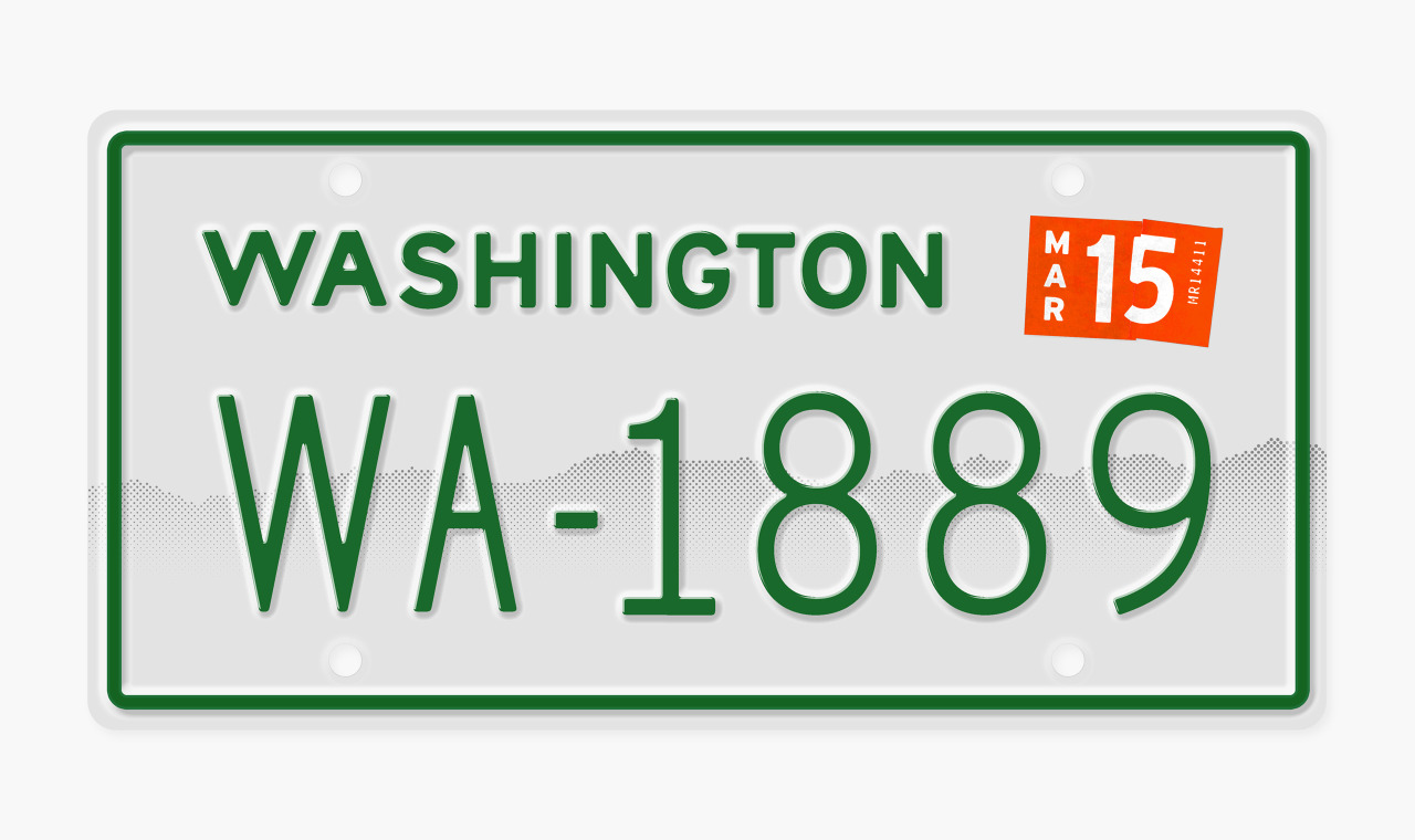
Nationally, Washington is all too associated with rain, grunge, rain, rain, Kurt Cobain, rain and general sadness. The blue and red colors of our current plates seemed quite strange to me and I saw little connection to the quite vibrant State I’ve come to know over the past three years.
Washington is the “Evergreen State” and you don’t need Wikipedia to know this. I still remember my entry to Seattle on I-90 driving out here from Chicago. From the Snoqualmie Pass to the hanging gardens over Mercer Island, the State was unbelievable fertile and green. From the literal “green-ness” of the landscape to the “green” thinking of the people here to the figurative growth of Seattle and the surrounding area - the color green was the obvious choice as the dominate color.
The type was something I experimented a lot with. Initially leaning towards a more folky typeface, as past plates have featured, I went with a custom version of Interstate Mono. Interstate has an obvious connection to the road and it’s edges allowed for nicely rounded embossing. The rounded edges were common in older plates (purely due to printing limitations) and ended up being something that stood the test of time and weather a lot longer than anything super detailed I might imagine.
I wrapped it up with a completely personal and subjective edit: replacing the existing Mt. Rainier graphic with a much more subtle hint at the Cascades. The gradient silhouette was taken from the Eastern view of the horizon, visible to much of downtown Seattle. There’s something magical about every sunset over the Cascades seen by the majority of Washington’s population in the Seattle/Tacoma area.
All in all this exercise was a nice break from designing for a screen and I’m honored to have represented my new home state along so many other fine designers.
Over the years, plates have gone quite far away from their original utilitarian form, into a new type of personal and local expression. I’ve got nothing against expression (or even specifically with plates) but this trend has certainly led to some of the most horrid graphic design I’ve ever seen.
So many of the original Washington plates I found were quite beautiful in their simplicity. No nonsense, no graphics even. Just the name of the state and the big number, nothing distracting from the two key pieces. Design was entirely informed by it’s clear purpose and the production capabilities of the plates themselves.
Personally, it felt arrogant to not to start with where we were and build on that. Of all current state plates, Washington’s was certainly not the worst.
Nationally, Washington is all too associated with rain, grunge, rain, rain, Kurt Cobain, rain and general sadness. The blue and red colors of our current plates seemed quite strange to me and I saw little connection to the quite vibrant State I’ve come to know over the past three years.
Washington is the “Evergreen State” and you don’t need Wikipedia to know this. I still remember my entry to Seattle on I-90 driving out here from Chicago. From the Snoqualmie Pass to the hanging gardens over Mercer Island, the State was unbelievable fertile and green. From the literal “green-ness” of the landscape to the “green” thinking of the people here to the figurative growth of Seattle and the surrounding area - the color green was the obvious choice as the dominate color.
The type was something I experimented a lot with. Initially leaning towards a more folky typeface, as past plates have featured, I went with a custom version of Interstate Mono. Interstate has an obvious connection to the road and it’s edges allowed for nicely rounded embossing. The rounded edges were common in older plates (purely due to printing limitations) and ended up being something that stood the test of time and weather a lot longer than anything super detailed I might imagine.
I wrapped it up with a completely personal and subjective edit: replacing the existing Mt. Rainier graphic with a much more subtle hint at the Cascades. The gradient silhouette was taken from the Eastern view of the horizon, visible to much of downtown Seattle. There’s something magical about every sunset over the Cascades seen by the majority of Washington’s population in the Seattle/Tacoma area.
All in all this exercise was a nice break from designing for a screen and I’m honored to have represented my new home state along so many other fine designers.