SOUTH DAKOTA
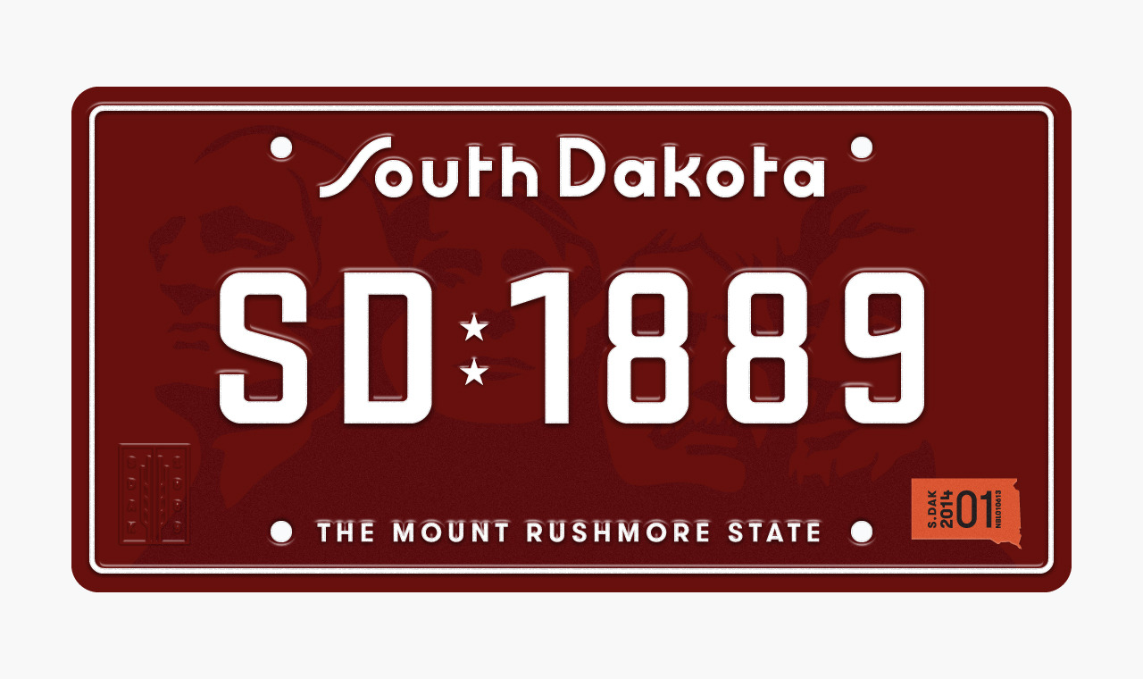
by Anthony LaneSouth Dakota’s plates have gotten increasingly complex over the years by use of gradients, changes in typography, color and the handling of the Mount Rushmore graphic. In order to restore some of the simplicity found in earlier plates, I opted to eliminate the script wordmark and draw reference from the fun and quirky letterforms found in the award-winning plate from 1974.
In addition, opting to do away with the current photo-realistic graphic of Mount Rushmore in favor of a simplified vector drawn version—commonly seen in earlier South Dakota plates. The plate is further differentiated by referencing the maroon and white color palette from the 1936 plate.
Lastly, the addition of the wheat stalk badge in the lower left corner as an agricultural nod to plains of South Dakota.