IDAHO
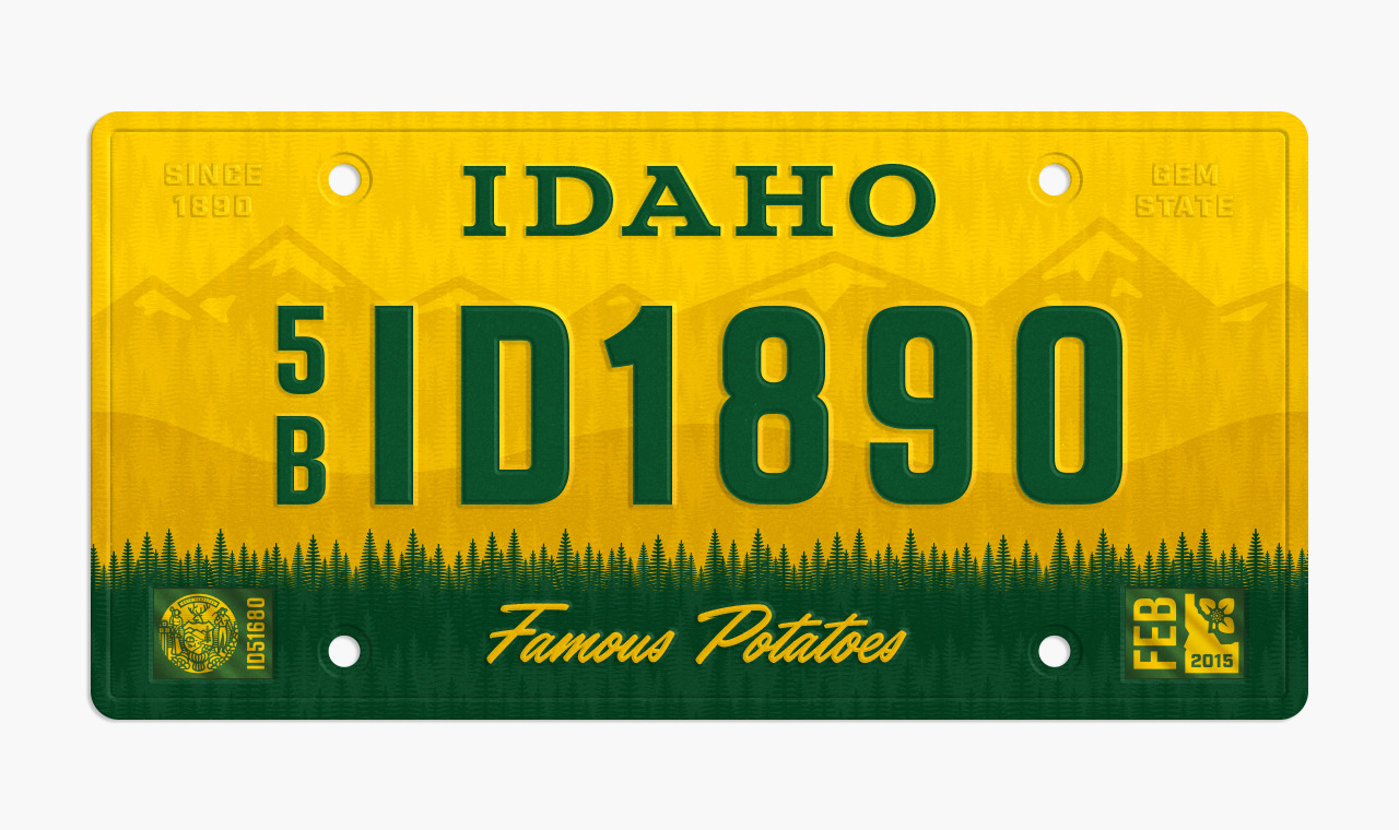
by Alex RinkerI consider my plate design more of an upgrade rather than a complete deviation from the current. Aside from the horrible red gradation and wonky typography, the current Idaho plate isn’t all that bad. I carried over the idea of the mountainous scenery faded in the background with the dense forest landscape in the foreground. The shapes of both are a bit more simplified and geometric for style. I also decided to keep in the county identifier, represented here by “5B” and the slogan “Famous Potatoes.”
My goal overall was to not just make the plate “look cool” but also have some symbolism within that was unique to Idaho. For example: The forest band across the bottom is comprised of the state tree (The Western White Pine), which also doubles as a reflective pattern that coats the entire plate.
Bonus Fact: Idaho was the first state to feature a graphic on their license plates. It was in 1928 and yes it was a potato.